top of page
Indeed
I designed an internal software tool to help product managers at Indeed track user drop-off rates, enabling data-driven decisions

TECHNOLOGY
Figma
Miro
PROJECT
UX Design Internship Summer 2022
DURATION
12 weeks
MY ROLE
Product Strategy, Product Management, User Research Lead, Interaction Design, High fidelity prototyping
Overview
Indeed is a leading global job search company that enables job seekers to find employment opportunities and employers to find candidates. With over 250 million users, Indeed is the mostly widely used job search engine. I worked as a UX Designer on the Data Platforms Team at Indeed, which is responsible for designing and developing tools for data collection, experimentation, and testing.
My role as the solo UX Design intern was to lead the end-to-end design development of a Funnel Analysis web tool that can track user drop off rates.
CONTEXT: WHAT IS FUNNEL ANALYSIS?
Funnel Analysis is a way to see how users move through different steps on a website and identify where they leave
Funnel analysis is a method of understanding the steps required to reach an outcome on a website and how many users progress through each of those steps. At each step of the user journey, the number of users typically decreases. The illustration below shows what a funnel representation of users going through the Indeed job board page might look like:
visit Job Board page
50,000 users
click on job card
30,000 users
view more details
15,000 users
click "Apply:
1,000 users
Problem
THE PROBLEM
Without a central tool, product managers at Indeed rely on disparate third-party tools to track user drop-off rates, leading to fragmented data and inefficient decision making
Hundreds of product managers at Indeed need to perform funnel analysis to measure user behavior and drop-off. However, without a central tool, they often resort to third-party solutions or manual methods, which are time-consuming and costly for Indeed
My goal was to develop a centralized tool integrated into Indeed's system to enable PMs to make better, higher-quality product decisions
Product Managers
👨💻
100 +
experiencing this problem, with many reporting stress and disorganization due to using external tools
additional time
⏱️
1.5 hrs +
is wasted manually performing funnel analysis due to the lack of a central tool.
DESIGN VISION
How might we build a Funnel Analysis tool that helps PMs at Indeed efficiently measure user drop-off rates and streamline their workflow?
OUR SOLUTION
I designed an internal Funnel Analysis tool that allows PMs to streamline data analysis, reduce costs, & improve efficiency
I led the research, design, and development of this project by collaborating closely with software engineers and program managers to test my ideas and functionality. * mention later The tool I built decreases the manual workload of employees by displaying a pre-defined funnel and provides them with necessary metrics.
.png)
USER RESEARCH
Understanding how PMs currently do Funnel Analysis
Since there currently isn't a central tool at Indeed to do Funnel Analysis, I took a look at some of the ways that PM's perform this task and what tools they use. The most common tools were Mixpanel and Fullstory.

MixPanel helped me understand what Funnel Analysis is and how it can be used to measure user drop off. MixPanel was our direct competitor and one of PM's most used tools

Fullstory was another popular tool that some PM's at Indeed used. It showed me how to have a visual data layout while still providing important data.
Gathering insights from PM's at Indeed
I conducted contextual inquiries with 10 product managers at Indeed to understand their use of Funnel Software and their work environment. These interviews revealed key interactions for my product design and highlighted PMs' current struggles.
💡 #1: Lack of a central tool makes Funnel Analysis inefficient & disorganized."
PMS lack organization and direction for Funnel Analysis because they're all using different tools such as IQL, MixPanel, etc. This leads to fragmented data interpretation & difficulty collaborating
💡 #2: Desire for easy and clear visualization options
Minimal visualization & lack of flexibility in adjusting diagrams was a major pain point across the different tools PMs used
💡 #3: Need flexibility to meet individual preferences
The tool should flexibly adjust to each PM's individual needs. For example, some PMs prefer data displayed through graphs, while others want only numbers.
DESIGN PHASE
Navigating Constraints and Prioritizing MVP Features
As I began ideating, I developed several features I wanted to include in my designs. During discussions, it became clear that some ideas were out of scope. To address this, I led a design workshop to align and collaborate with developers on defining essential MVP features and determining feasibility. This workshop allowed me to collaborate with developers and helped me narrow down my scope.


HIGH FIDELITY PROTOTYPES
Empowering product managers with data
My goal during this project was to design a project that would empower Product Managers to make informed decisions efficiently and alleviate their workload.
Below is a look at the final designs and rationales.
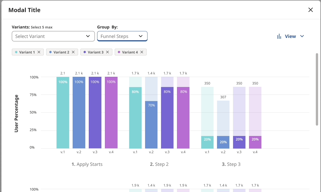
FUNNEL ANALYSIS TOOL OVERVIEW
Data Visualization Made Easy
Now, PMs can access a predefined funnel analysis tool that provides necessary data. The bar chart displays the number and percentage of users who drop off at each step of the user journey.
PMs can directly compare user drop-off between design variants, as each variant is represented side by side in the bar chart.

GROUPING AND ORGANIZING DATA
Versatile Grouping Features
My design includes a 'group by' feature that empowers PMs to control how data is displayed. They can group data by Funnel steps to compare variants across steps, or by design variants to analyze drop-off rates for each variant separately.
GROUPING AND ORGANIZING DATA
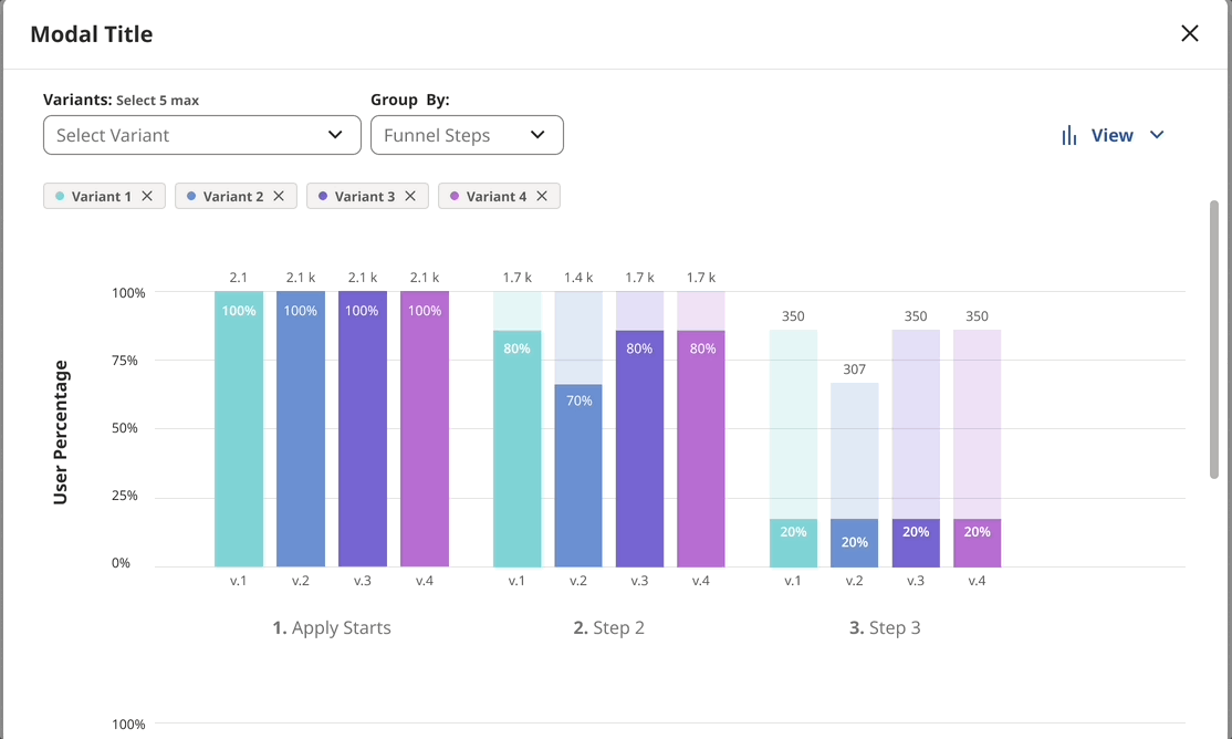
Allowing Flexibility and User Choice
A common pain point identified during interviews was the lack of visual options and flexibility in current tools. PMs expressed a desire to choose how data is presented.
My designs address this by offering user choice and multiple display formats, including bar charts, tables, and more.
My designs completely transformed the Funnel Analysis process at Indeed from being a tedious, manual process to an automated, efficient task. I came up with 3 distinguishing characteristics that set my design work apart.
1. No more third-party tools needed:
Previous tools used involved manual labor on the PM's part, often having to write extract the data and create a funnel in a third-party application. Now, the funnel is predefined in a company tool and easily available
2. Flexibility
My refined design allows program managers to access different types of data (numbers, percentages, rates, groupings, etc) all in one platform
3. Effective Visuals
My design resolves the pain point #3 by bringing in easy visuals (bar graphs, lines, tables) with different options adjustable to the program manager's needs
RESULTS + NEXT STEPS
20 %
increase in user satisfaction (measured through usability testing)
5 +
different platforms and teams at Indeed now use the Funnel tool I designed
The Funnel Analysis tool received tons of praise and got implemented into 5 different platforms at Indeed!
"I feel like this could be something that simplifies my job quite a lot. All in one place and easy to access"
~ User Testing Participant
"As a program manager, I think this tool will help me do my job effectively. It'll give me access to my data in one area and let me organize and use it how I see fit. "
~ User Testing Participant
"I can see this cutting down my work time by a ton...something that I can just pull up and have the work done for me is going to be something I'll use "
~ User ITesting Participant
bottom of page